Quero Simulados
Mock Exam Platform
Designing a performance comparison platform for Brazil's most competitive job market. From student research to shipped product.
The challenge
Qconcursos is Brazil's largest exam-prep platform, with over 10 million registered users. More than half of them already used a limited native simulation tool. That data revealed a clear product opportunity: build a dedicated mock exam experience born from real user demand.
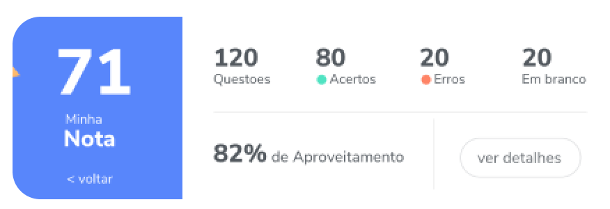
Students preparing for government exams had no structured way to measure their performance against real competition. They knew their score but not what it meant. Without comparison data, there was no way to know if a 71 was good enough to pass. The experience was stressful, isolated, and directionless.
Core QuestionHow do we turn an individual exam score into a meaningful performance signal that tells students exactly where they stand against thousands of real competitors?
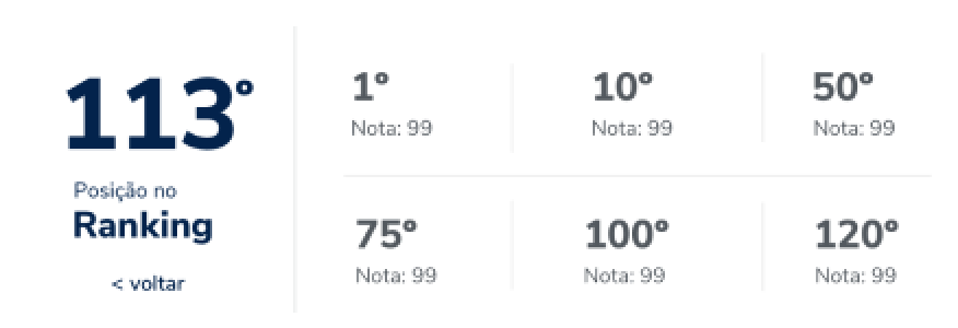
01 · Performance with context. Give students their score, the national average, and their ranking position broken down by subject and by Brazilian state.
02 · Calm under pressure. Design an exam experience that absorbs student anxiety through clarity, focus, and real-time feedback.
Who we're designing for
After 40 student interviews, we identified 3 distinct user profiles. Each had different motivations, study habits, and levels of anxiety around exam performance.

Gabriel, 31
Determined and career-focused. Already has a degree but wants a government position for stability and salary.

Diogo, 37
Effortless and dedicated. Sees studying as a way to change his life. Has been preparing for a while but lacks direction.

Advanced Student
High performer who wants to fine-tune results. Studies consistently and needs granular performance data.
Core InsightStudents didn't just want to practice. They wanted to know exactly where they stood against thousands of real competitors. That single insight shaped every major product decision.
From research to shipped product
The input came from 40 student interviews and a clear product gap inside Qconcursos. I mapped the insights into a structured design process and drove every decision from real user needs.
Discovery
Conducted 40 student interviews to map pain points, motivations, and mental models around exam preparation. Ran competitive benchmark and financial projection (Bass Model) to validate the business case.
Define
Mapped 3 student profiles and 2 detailed personas. Defined 5 product goals and 6 core value propositions. Turned pain points directly into features.
Design
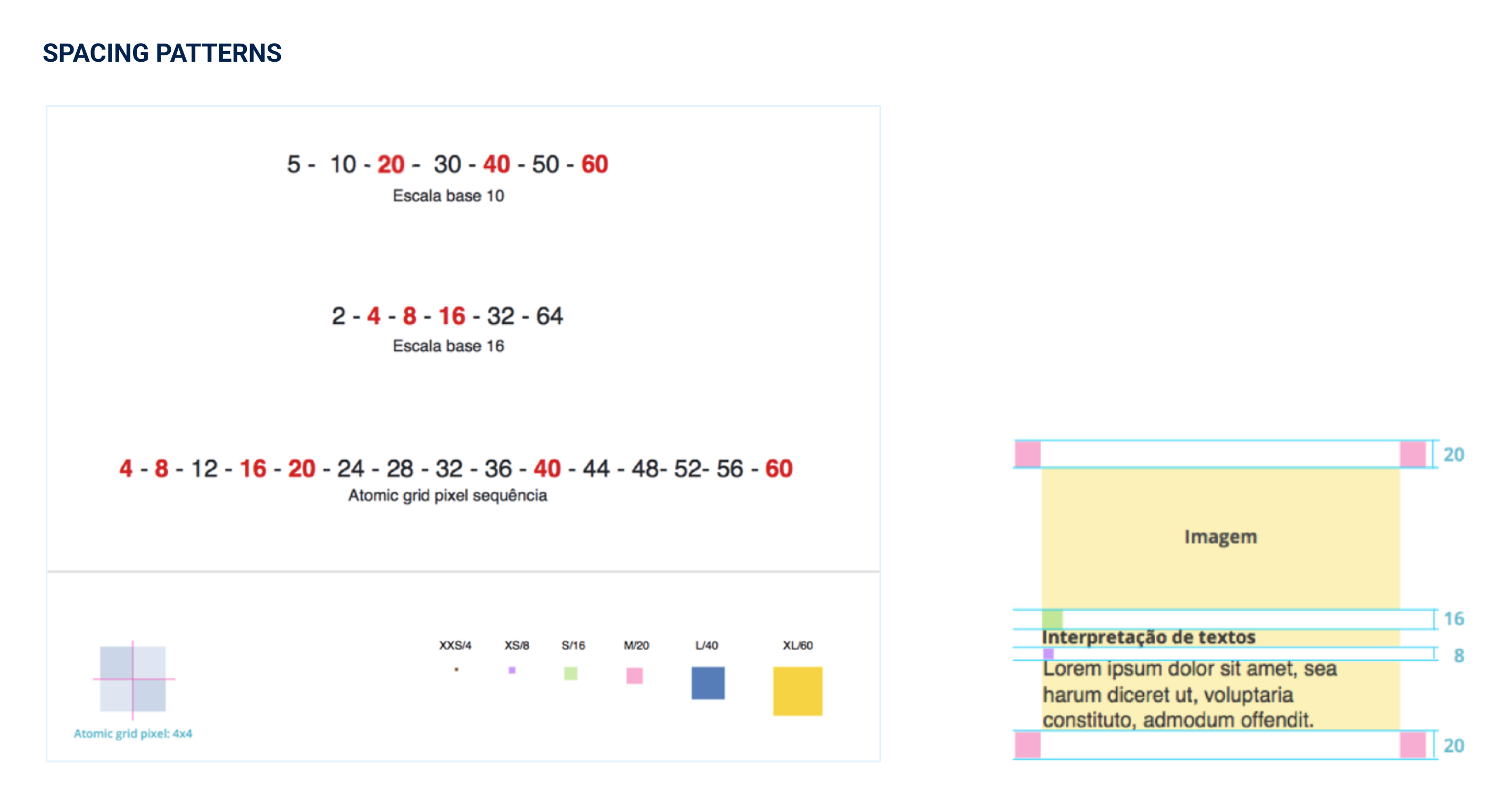
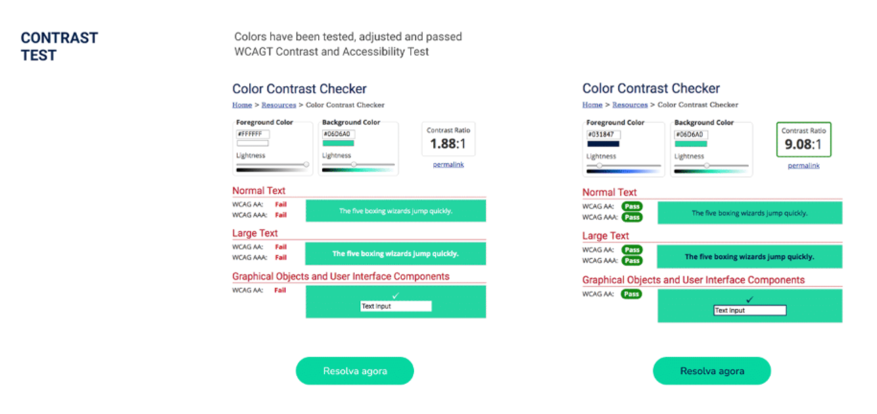
Started with low-fidelity paper prototypes, then evolved to high-fidelity screens. Built the design system in parallel: spacing scale, atomic grid, typography, and color palette with WCAG contrast validation.
Deliver
Shipped the full product: onboarding flow, home, exam experience, results page, corrected answers view, modals, and user journey email sequence. Designed the media campaign for launch.
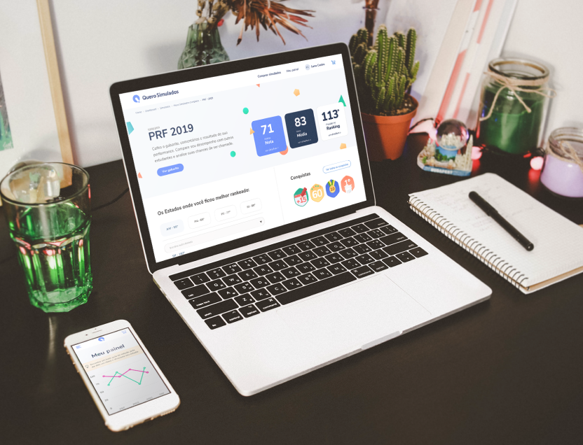
Core features and design thinking
Four interconnected experiences, each solving a distinct student need while maintaining product coherence.
Performance with context
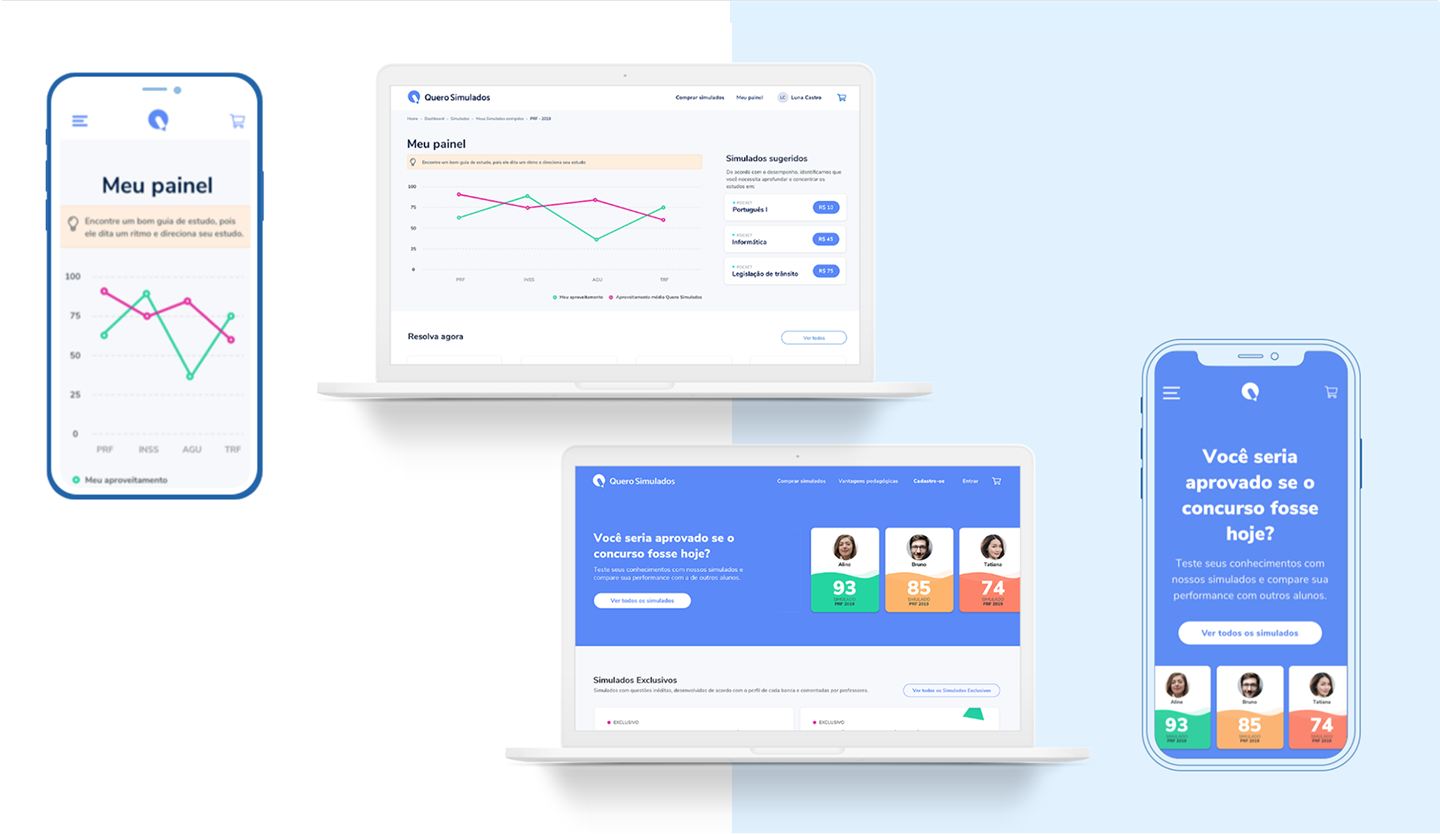
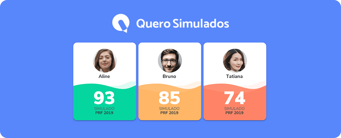
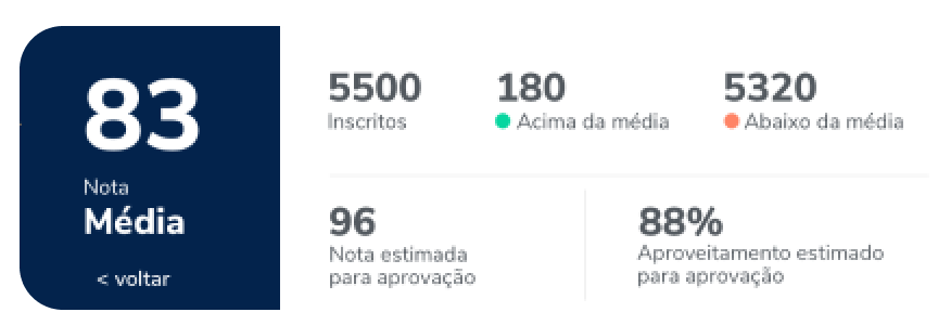
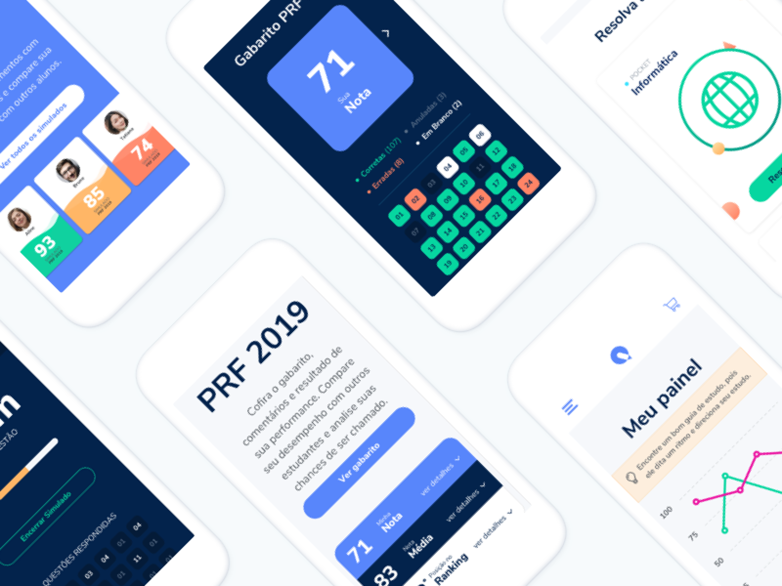
The feature most requested by students became the core of the product. After completing a simulation, students see their score, the national average, and their ranking position broken down by subject and by Brazilian state. One number became a full performance picture.
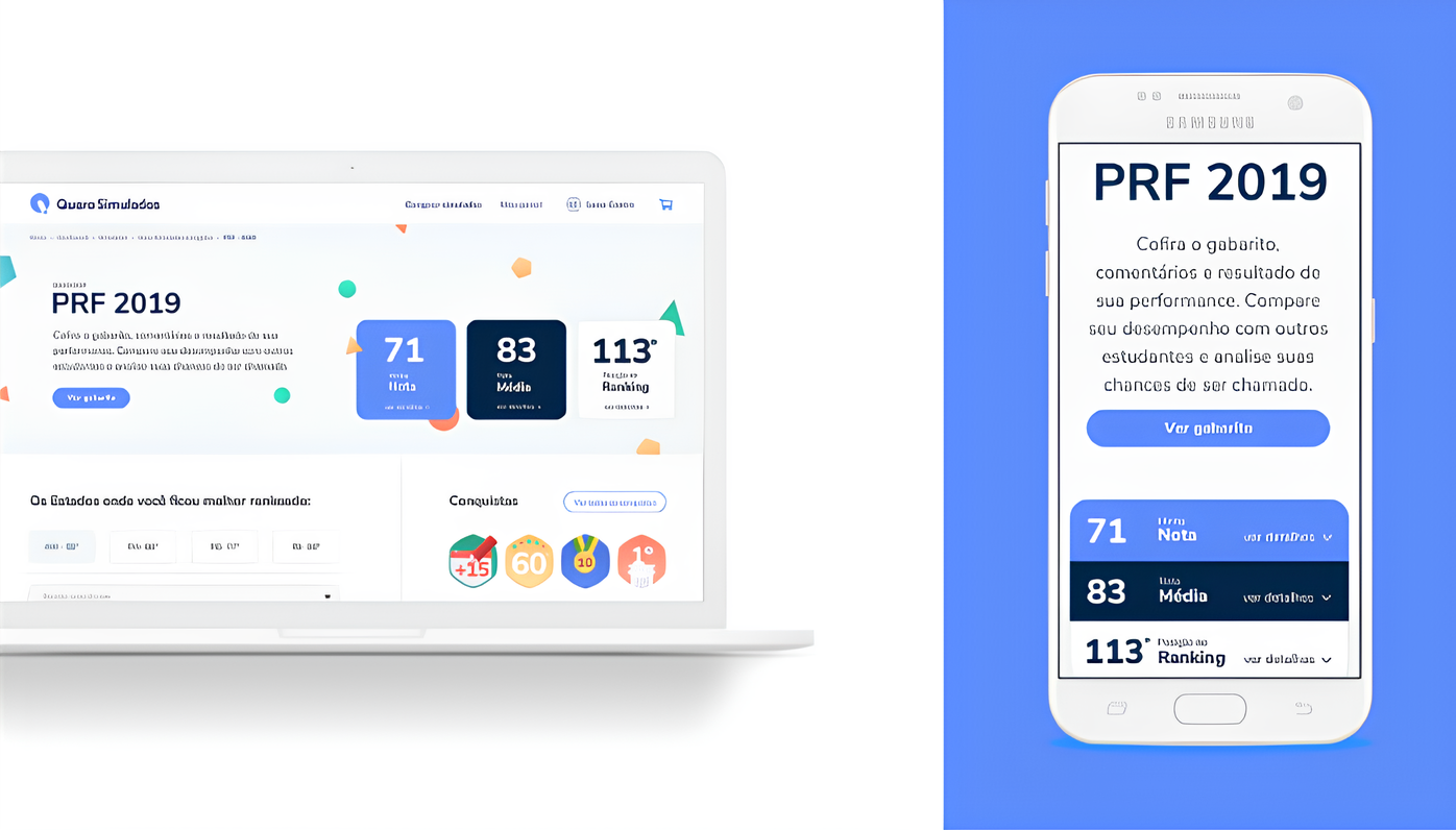
Score with context: Students see their score, the national average, and their ranking position simultaneously. One screen tells the full story.
State-level ranking: Added after launch based on direct user feedback. Students wanted to know if they would pass in their specific state, not just nationally.
Subject breakdown: Performance by discipline highlights exact strengths and weaknesses, and suggests related simulations to improve weak areas.
Tranquility and reliability under pressure
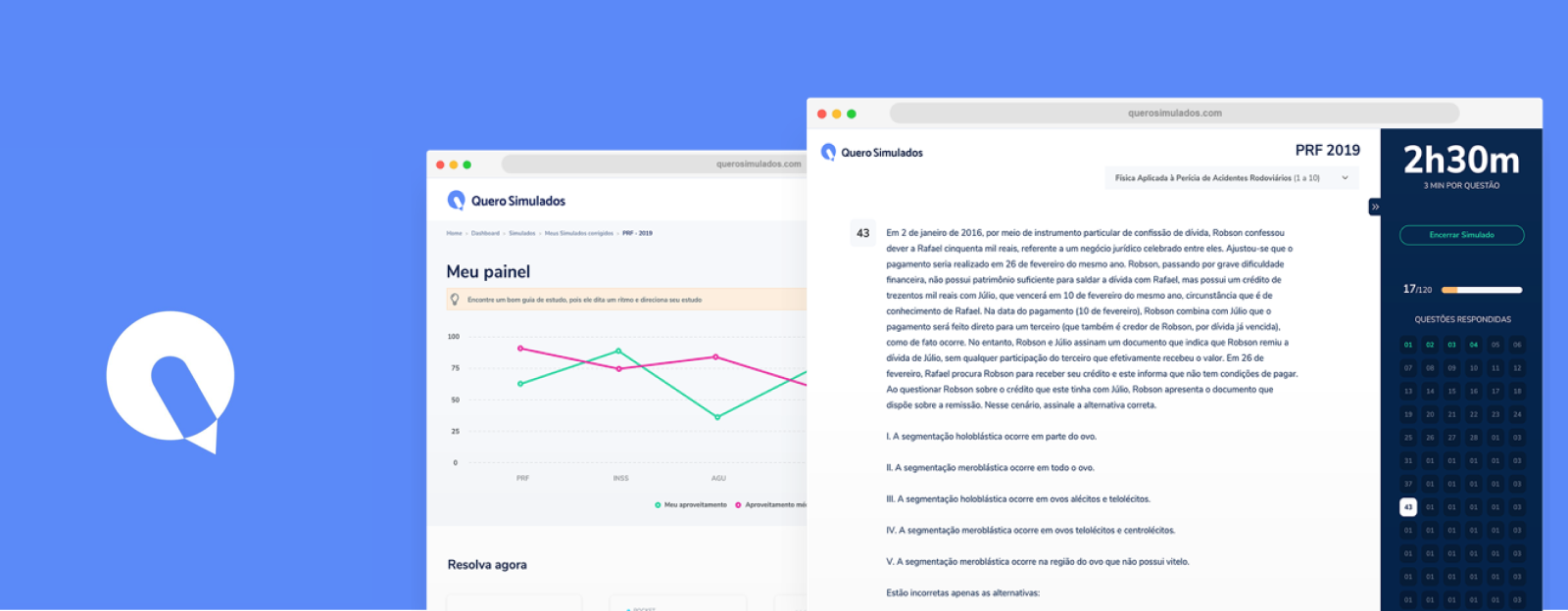
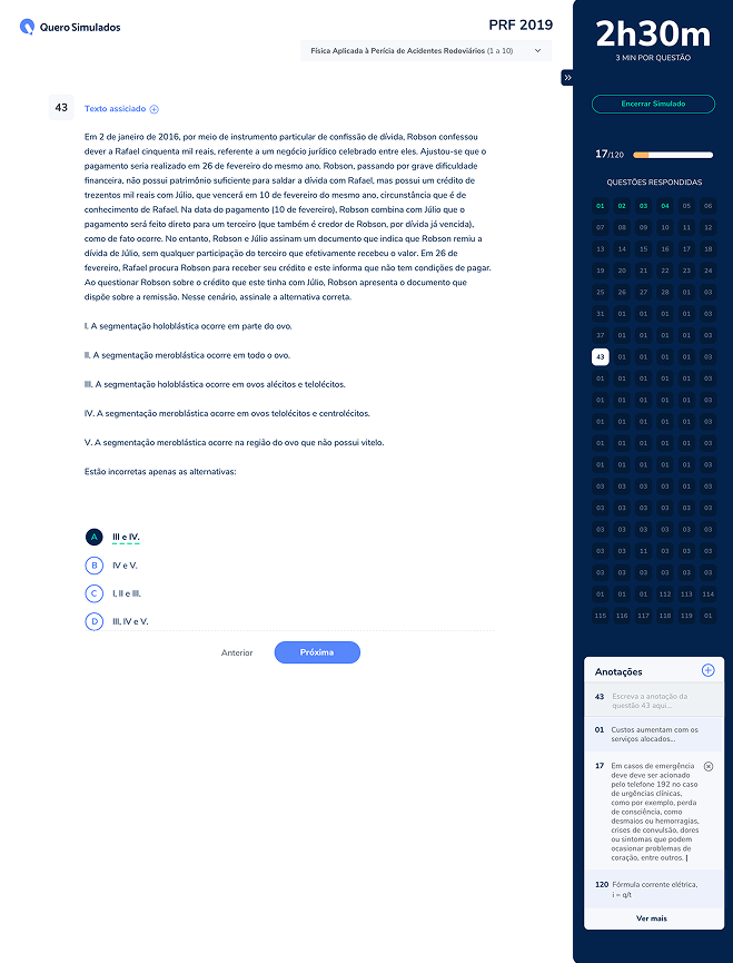
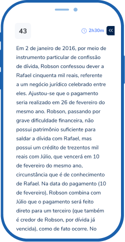
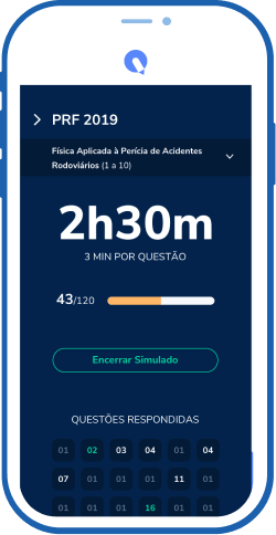
A government exam can take up to 4 hours. Concentration is the product. Every UI element that was not essential to answering questions was removed or hidden.
- No distractions: No header, no navigation, no noise. The exam interface exists in its own focused environment, separate from the rest of the platform.
- Collapsible sidebar: Students can hide the question navigator to go full focus mode. Every pixel belongs to the question.
- Answer card system: Color-coded feedback at a glance. Green for correct, red for wrong, dark blue for canceled, white for unanswered. No interpretation needed.
- Annotation space: Students can add notes alongside each question during the exam, replicating real exam behavior.
Friendly, familiar, communicative
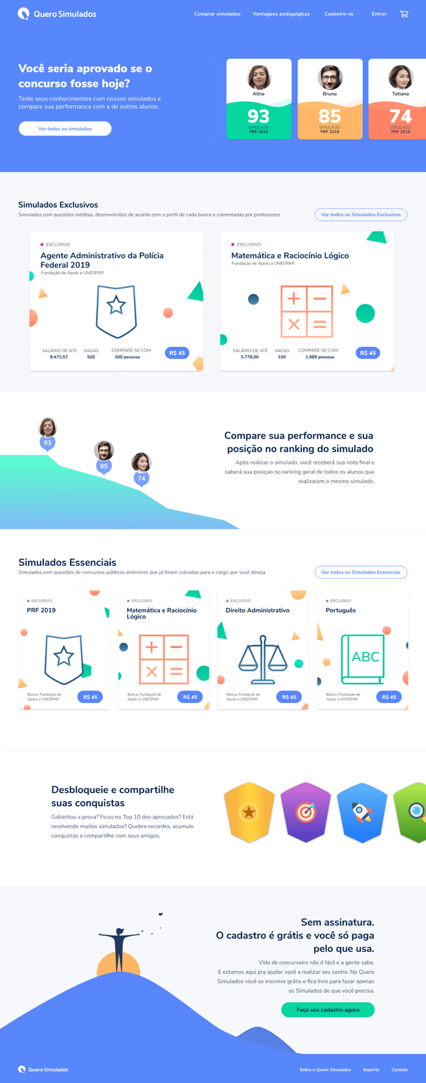
First-time engagement is fragile. The onboarding and home were designed to introduce the product value without overwhelming new users. Clear interactions, easy to adapt and learn, with no training required, and a home page that balances the rational and the emotional.
- Mobile first: The entire onboarding flow was prototyped on mobile before scaling to desktop. The smallest screen defined the constraints for every other breakpoint.
- Progressive disclosure: One concept per screen. Students are not shown everything at once. Each step reveals only what is needed to move forward.
- Emotional balance: The home page balances rational and emotional: sometimes stimulating the student about how close they are to the job position, sometimes offering tools to measure that progress.
From purchase to exam completion
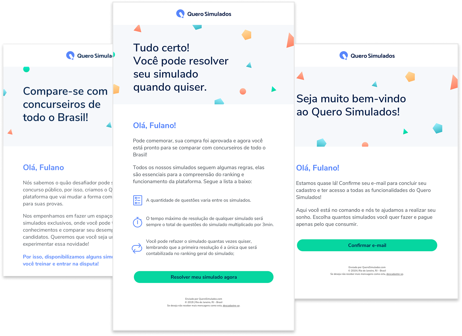
To monitor the journey from purchase until the simulation is executed, we designed a full email sequence. Each email had one clear action and one clear message. No noise, no distraction, just the next step the student needed to take.
One action per email
Each email in the sequence had a single CTA. Welcome, reminder, results, encouragement. Students always knew exactly what to do next.
Tone matches the moment
Welcome is warm and celebratory. Reminder creates urgency without pressure. Results celebrates the achievement and suggests next steps.
Journey continuity
The sequence was designed as one connected experience, not isolated messages. Each email referenced the previous step and pointed to the next.
Key choices and why
The thinking behind the most important design decisions. Not just what was built, but the reasoning that got there.
The Comparative as the Core
Research showed students did not just want to practice. They wanted to know where they stood. Instead of building another score screen, we made the ranking the hero of the results page. Your score only makes sense in context. The comparative gave that context.
Distraction-Free Exam Interface
A government exam can take up to 4 hours. Concentration is the product. Every UI element that was not essential to answering questions was removed or hidden. The collapsible sidebar, minimal header, and focus mode were not nice-to-haves. They were the core UX principle.
Design System from Day One
Building the spacing scale, atomic grid, and component library in parallel with the first screens meant every decision made early stayed consistent through delivery. For a product with this many states and screen types, the system was the real deliverable.
Shipped. Tested. Validated.
Quero Simulados launched and was tested with real students before release. User feedback generated meaningful product iterations, including a ranking by Brazilian state, which became one of the most valued features after launch.
The product was discontinued due to internal company restructuring, not product-market fit. The design process, the research, and the shipped product remain as proof of what end-to-end product design looks like at scale.
What I took away
Research-Driven Product Direction
The 40 student interviews were not a formality. They directly generated features. The state ranking, the focus mode, the comparative as the hero: all came from things students said out loud in interviews. Research was the product strategy.
Earlier Quantitative Validation
The qualitative research was strong. In retrospect, I would complement it earlier with quantitative data: conversion funnels, drop-off points in the existing native tool, to prioritize features with more precision before going into design.
Anxiety is a Design Problem
The product's core challenge was not technical. It was emotional. Students were anxious. The design had to absorb that anxiety through clarity, feedback, and context. Every calm interface is a product decision.
Edtech Monetization Patterns
This project introduced me to the intersection of education and commerce: students buying individual simulations, the role of pricing in perceived value, the email journey from purchase to usage. An area I would go deeper in with more time.