Blueprint
Workflows a team can draw, run and hand off
Blueprint is a collaborative project between Jalasoft and Jala University, where final-semester IT students work on a real product, in a real team and company setting. As teacher and designer, my job was to improve the existing design of the tool and add three new features: Dark Mode, Filters and Card View. Then I guided the students through building them.
A real product,built by students
Blueprint was the final project of the Jala University development degree. The students were not doing an exercise: they joined an existing product, with a backlog, a codebase and a company on the other side. The design had to be clear enough for people building their first real product.
students mentored on the design
months, from redesign to implementation
new features: Dark Mode, Filters and Card View
Draw the process once,run it every day
Blueprint turns a company process, like hiring a candidate, into a workflow anyone on the team can follow. Each person sees only the steps and actions that belong to them.
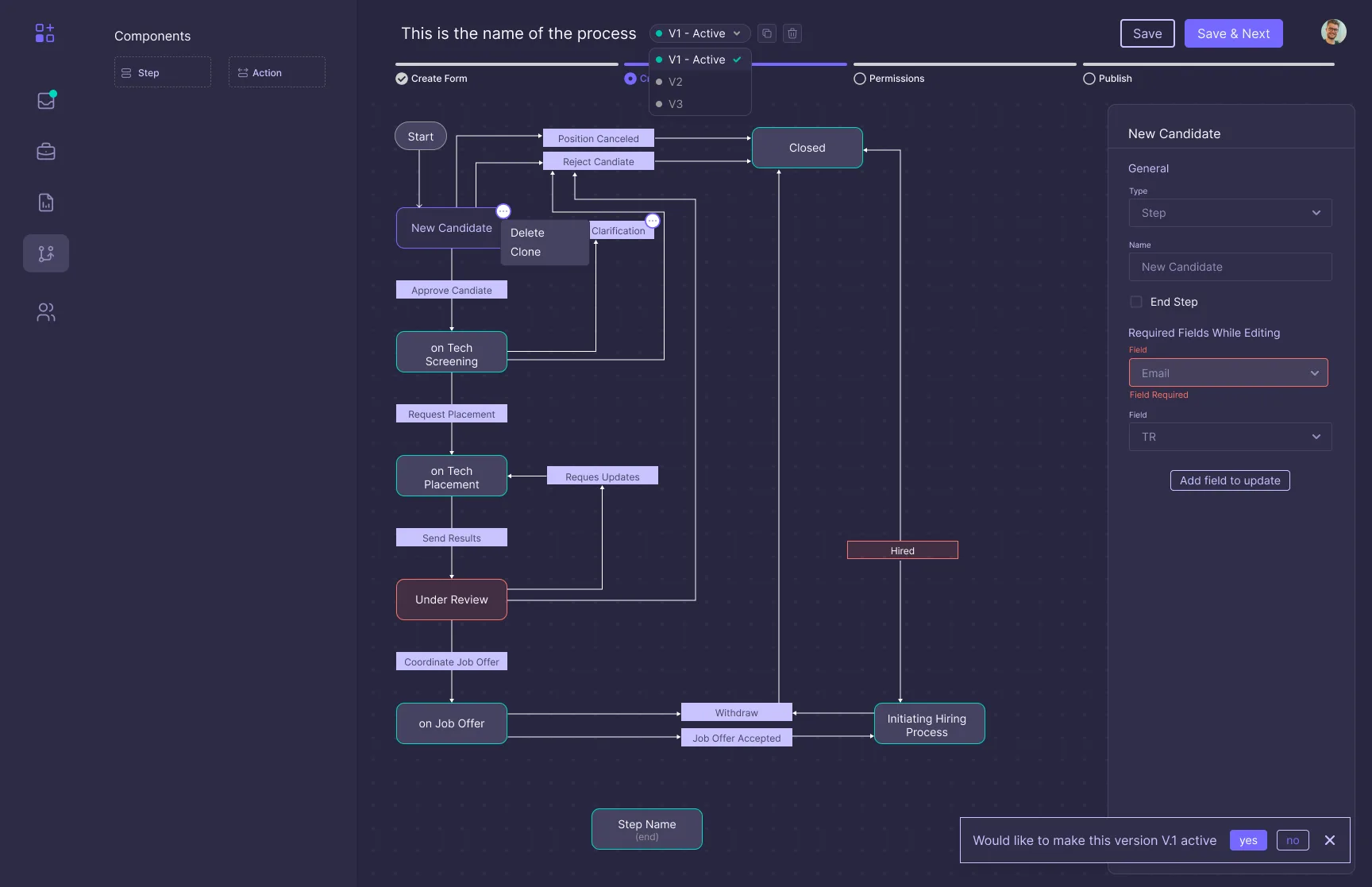
Steps and actions on a canvas, with versions, required fields per step and permissions.
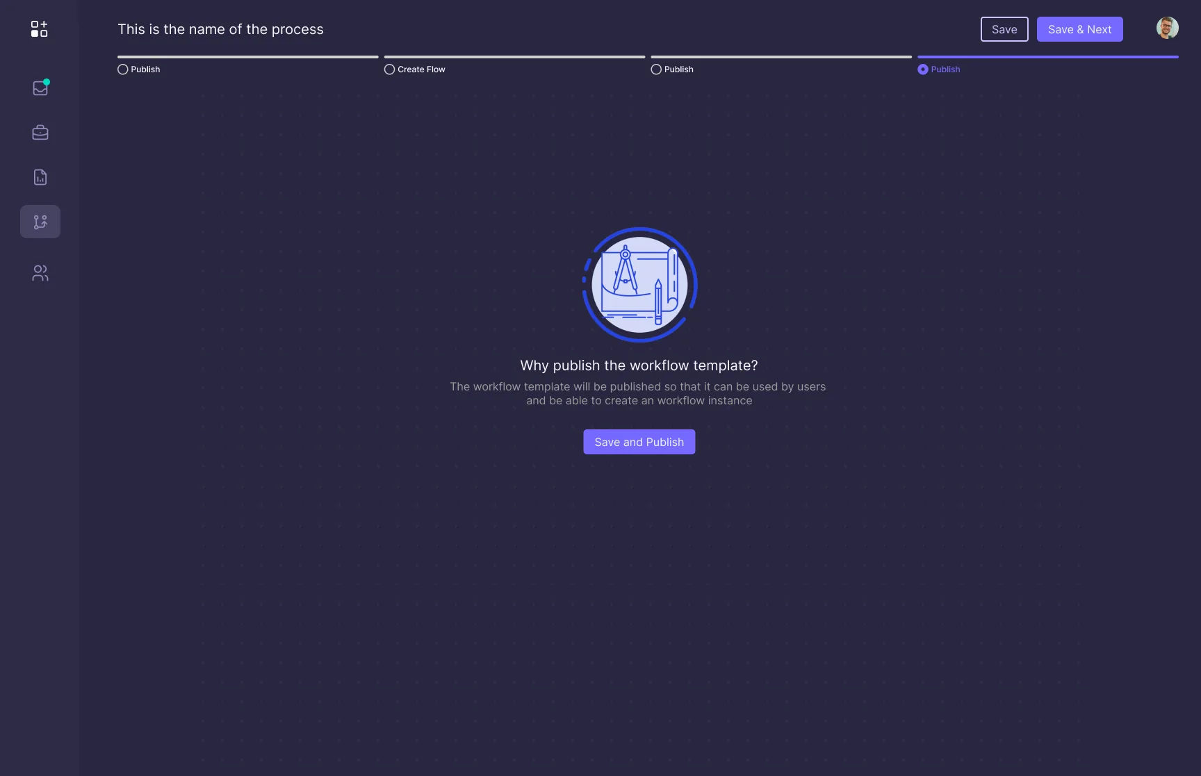
Once published, the flow becomes a template the team can use to open new instances.
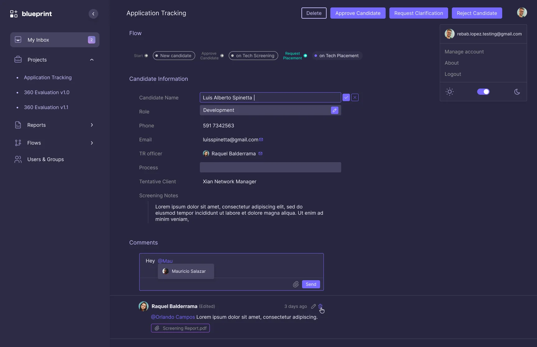
Every instance shows where it is in the flow, its data, comments with mentions and the next possible actions.
Improve what exists,add three features
The tool already worked. The three new features answer the same need: see the work, find the work, and use the tool for hours without tiring your eyes.
Card View
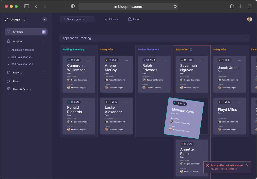
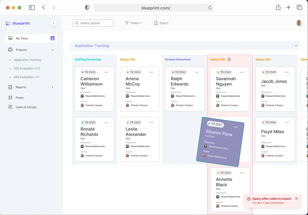
A board grouped by step, next to the list view, with one toggle between them. Each card shows the ID, the person, the role, the requester and the owner. Cards move between steps by dragging, and a column the user can't edit shows a lock and explains why instead of failing in silence.
Filters
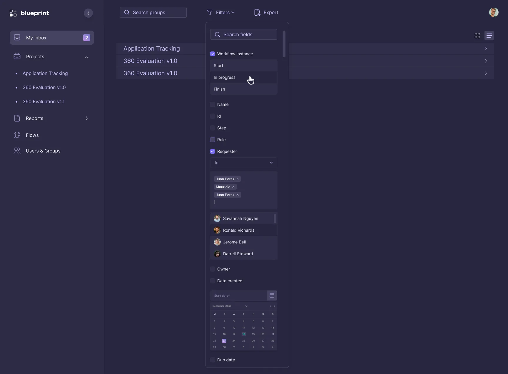
One panel with the fields that matter: workflow status, name, ID, step, role, requester, owner and dates. Each field opens its own condition, like people as removable chips or a date on a calendar. Active filters stay visible above the results, with a single Clear filters.
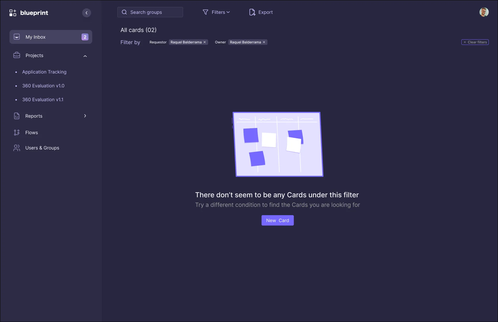
No results is not a dead end
When a filter returns nothing, the screen says so in plain words, suggests trying another condition and offers the next action: create a new card.
Dark Mode
People spend the whole day inside Blueprint. Dark Mode lives in the account menu and covers every screen, including the status colors of each step, which keep the same meaning on both backgrounds.
Drag the handle to compare the two themes
Designing beyondthe happy path
Students tend to build the screen that works. I designed the moments when something goes wrong too, so nobody had to invent them during implementation.
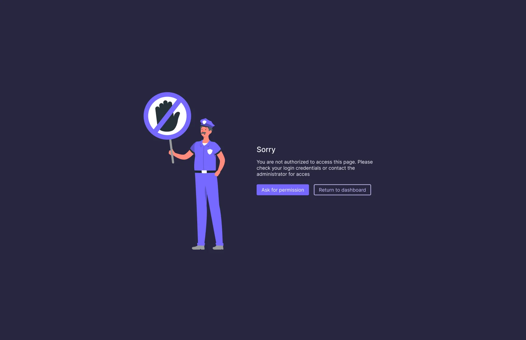
The unauthorized page explains what happened and offers two paths: ask for permission or return to the dashboard.
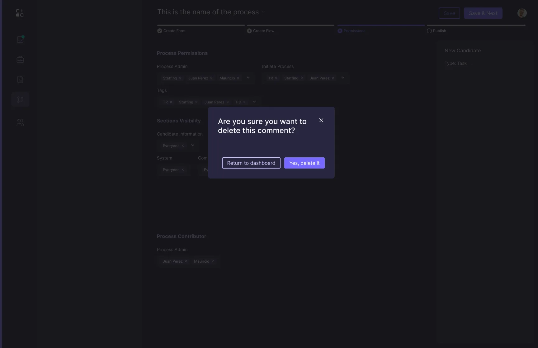
Deleting a comment asks for confirmation first, because the history of a case is shared by the whole team.
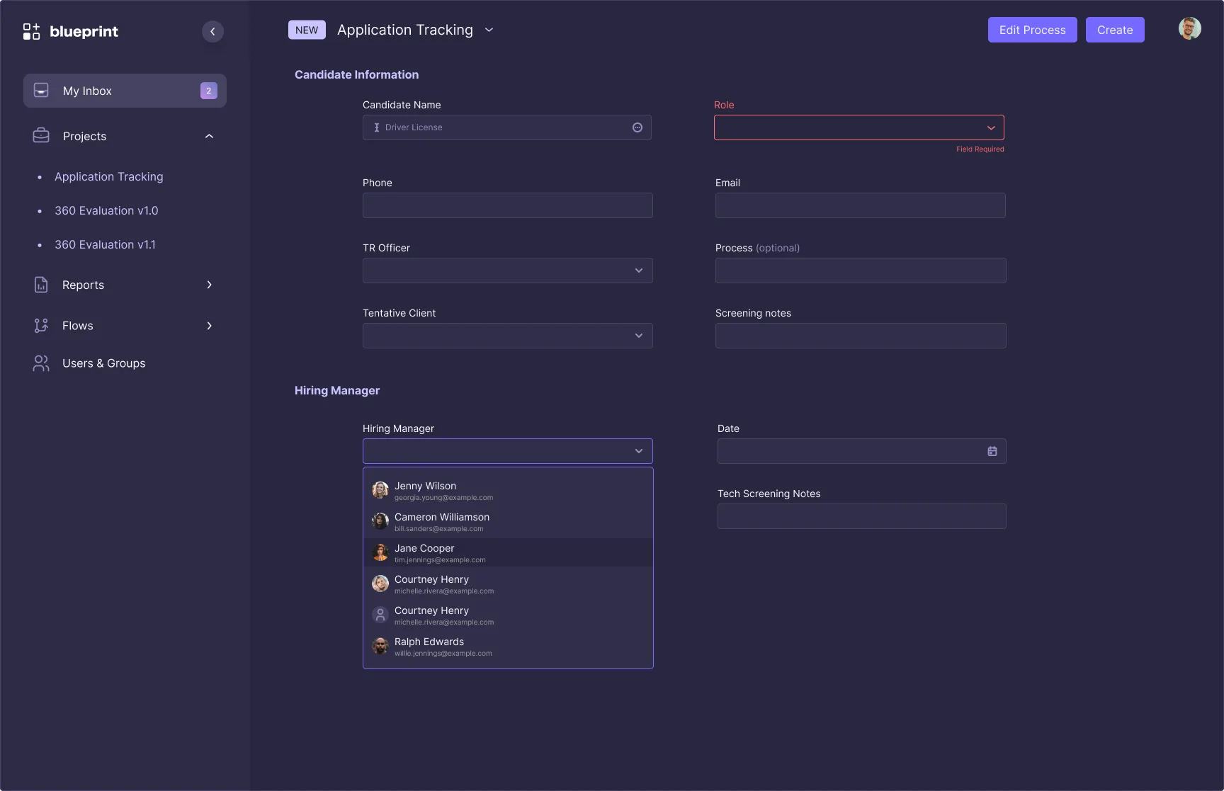
Required fields are marked where they are, at the moment they matter, and not in a message at the top of the form.
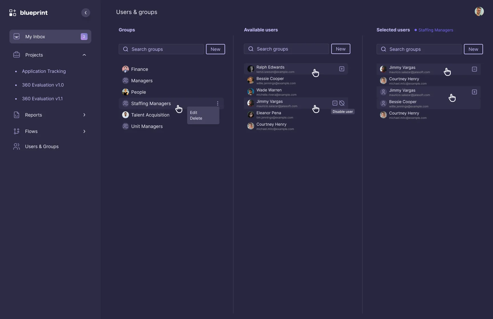
Users and groups in three columns: pick a group, see who is available and who is already in it, and move people with one click.
One set of components,two themes
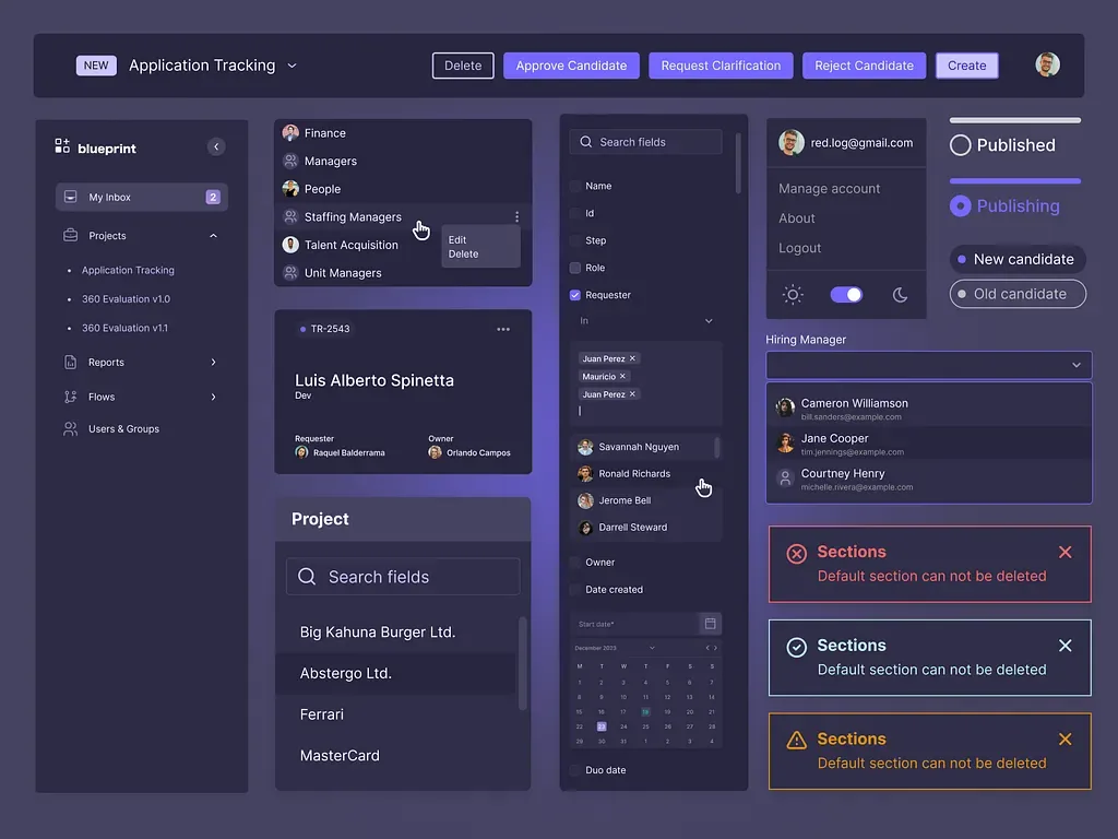
Navigation, cards, lists, filters, dropdowns, toasts and statuses were organized as components. That made Dark Mode a matter of swapping colors, not redrawing screens, and gave the students one reference to build from.
The design only countsonce it's built
I ran the handoff to the young developers and stayed with them through the implementation phase, so the new features made it into the product the way they were designed.
Complete specs for each feature: states, behaviors and edge cases, written for people building their first product.
Sessions to walk through the design, explain the decisions behind it and answer questions before the code started.
Continuous support during implementation, answering questions and reviewing what was built along the way.
What teachingtaught me about design
Whoever builds is the first user of the design. If the documentation is confusing, the feature will be too.
What isn't designed gets improvised. Drawing the empty, locked and denied screens up front meant nobody had to guess.
Organizing the interface as components is what lets one design work in two themes. Without it, Dark Mode would be a second product.
With 60+ people building, I couldn't review every screen. Teaching the reasoning behind each decision let the students make the right call on their own.
Good design for a team in training is design they can build.
Let's talk